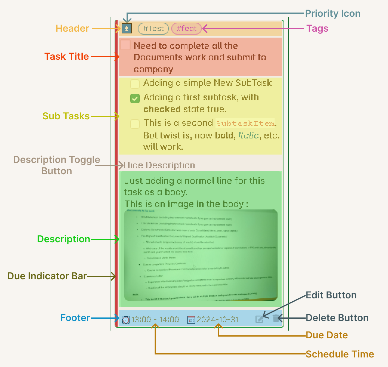
Task Item Card
These is the card which you see inside the column under any specific board.
Card styles
Using the “Task card style” setting you can configure the look of this component. As of version 1.10.0, you have two different card styles, as shown in the below image :
Selectively hide properties
You will find a button called “Show/hide properties” in the board header as shown in the below image :
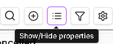
This button will open a menu through which you shall able to show or hide specific properties or sections of this task item card component. This gives you a great functionality, to configure the look of this task item card component as you like. You can have a simple cleaner look or show all sections/properties within the card.
Sections
Header
The Header section of this card will consists of the following things :
1. Note Name : (Added in v1.5.0) You can now see the name of the note where the task is located. This helps you quickly identify which file contains the task.
2. Priority : You will be able to see the priority of the task which you gave to this task.
3. Tags : All the tags you have given to this task will be show here in horizontal aligned style. Starting from v1.6.0, tasks also inherit tags from their note’s frontmatter (virtual tags).
4. Task Status : (Added in v1.3.0) Visual indicator showing the current status of the task using custom status emojis compatible with the Tasks plugin.
5. Card Drag Icon : Use this to drag and drop the task between columns.
Task Title
This is the main content of the task, the short summary. You can give any type of formatting as normally you give in markdown format.
Sub Tasks
This section will show you all your sub-task of the main task. They will be arranged in vertical position, one below the other, as you have placed them in the markdown file, same order will be preserved. These sub-tasks will have their own checkboxes to change their status and they will be indented from the main task.
This section will also show multi-level indented sub-tasks as well in the same order, as they appear in the markdown file. The indented length will be changed based on the layout.
Task Description
By default the Task Description content will be hidden. You will see a light colored text Show Description. This is actually a clickable text, and once you click on this text, the Description Section will expand.
The Description content is kept hidden by default is because, there can be a lot of content inside the description for the task, and keeping in visible will consume a lot of board area, which will defeat the methodology of a Kanban Board. Whenever you want to take a look at the content of the Description of any specific task, you can expand it and read the content or make use of the links from the content.
Another thing is, the content will be compressed, that, is the indentation of the content lines will be removed to save space. The idea here is to just show the content and not to worry about the formatting much, although all the other formatting will be applied like bold, italic, etc. The indentation is removed to again, show all the content in as much less area as possible. You can look at the actual content by opening the Task Editor or by directly opening the markdown file.
Child tasks
Under this section you will see the child tasks rendered in a list as per their order defined in the depends-on property.
Footer
Depending on the card style you have chosen, all the rest of the task properties will be shown under this section either as a capsules (in case of Tasks plugin emoji style) or as a Bases plugin like key-value pair style list.
Additional Features
Card Background Color (Added in v1.4.0): Task cards can display a background color based on their tags, making it easier to visually identify and categorize tasks.
Scroll to Task (Added in v1.5.0): Click on a task card to scroll to its exact location in the note and highlight the first line of the task.
Hide Metadata (Added in v1.3.0): You can choose to hide task metadata from the task title for a cleaner look in the settings.